
The map of the world has undergone a drastic change for pupils in the U.S. city of Boston. Re-sketching an almost 500-year-old portrayal of planet Earth as they thought they once knew it, the Gall-Peters projection has shone a new light on the size of countries from around the world.
Public schools in Botson, U.S. have introduced the new map into their curriculum, which is much different from the traditional Mercator projection.
The Mercator projection has been common in study-table atlases and bedroom wall pin ups, but authorities in Boston city are confident that their newly introduced map offers something closer to the geographical truth.
The Gall-Peters projection shrinks both Europe and the U.S., stretches South America and extends Africa. First introduced by historian and cartographer Dr. Arno Peters at a Press Conference in Germany in 1974 it generated a firestorm of debate, and is still a largely controversial topic.
Defined by its creators as an “equal-area” map, it distorts the shape of countries as a two-dimensional visualisation of a three-dimensional globe but accurately scales the surface areas. It is believed to show the correct size and proportion of the continents.
The resulting map goes a long way to rewriting the historical and sociopolitical message of the Mercator map, which exaggerates the size of imperialist powers.
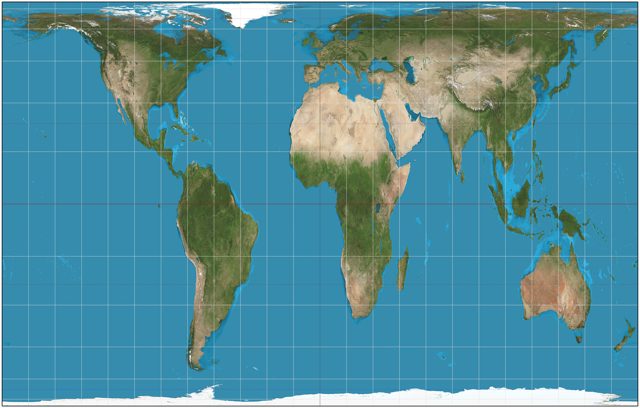
Devised in 1569 the Mercator projection was created by renowned Flemish cartographer, Gerardus Mercator. Its main purpose was to aid navigation along colonial trade routes by drawing straight lines across the oceans. It is thought that this greatly exaggerated the size of the whole northern hemisphere – making North America and Europe bigger, or at least the same size, as South America and Africa. Western Europe was also placed in the centre of his map.
On Mercator’s map, South America is made to look the same size as Europe – when in fact it is almost twice as large.
Greenland looks roughly the same size as Africa, when it is actually around 14 times smaller.
Following the procedure of the Gall-Peters projection, and drawing a country or continent based on surface area, one can roughly see the difference in size to what is portrayed on Mercator’s map.
Africa surface area: 30.2 million km2
U.S. surface area: 9.1 million km2

Africa surface area: 30.2 million km2
Russia surface area: 16.4 million km2

Africa surface area: 30.2 million km2
China surface area: 9.4 million km2